
CSS : The Personal Stylist for Your HTML Website
Everything You Need to Know About The Stylist That Transforms HTML into Stunning Websites.


Introduction
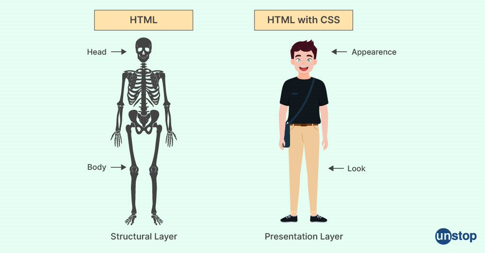
CSS ( Cascading Style Sheets ) is like a personal stylist for any HTML Website . It is a language to style and format the layout of webpage, controlling aspects like colors, fonts, spacing, and positioning. It enables developers to style and layout web pages. In this article I will introduce you to CSS basics, the box model, the flexbox, the positioning and CSS specificity—essential concepts for anyone starting web development journey.
Understanding CSS :
Brief History of CSS:
CSS was created by Håkon Wium Lie in 1996 while working at CERN.
Over the years CSS has evolved through various versions :
CSS1 (1996): Basic styling features like fonts, colors, and margins.
CSS2 (1998): Added positioning, z-index, and media types.
CSS3 (2000s): Modularized CSS with new features like animations, gradients, and responsive design.
Modern CSS: Continues to evolve with advanced features like CSS variables, grid layouts, and improved browser support.

Basics of CSS
How CSS Works
CSS works by selecting HTML elements and applying styles to them. These styles can be written in:
Inline CSS: Directly within the HTML element.
Internal CSS: Inside a
<style>tag in the<head>section of the document.External CSS: In a separate
.cssfile linked to the HTML.
Example of an external CSS setup:
<!DOCTYPE html>
<html lang="en">
<head>
  <link rel="stylesheet" href="styles.css"> <!--link tag links the .html file to the .css file -->
</head>
<body>
  <h1 class="title">Hello, World!</h1>
</body>
</html>
In the styles.css file:
.title {
  color: blue;
  font-size: 2rem;
}
<!— ….—> is used to add comments in .html file
/* … */ is used to add comments in .CSS .
CSS Syntax
Therse are two rule we need to keep in mind while styling the raw website through css.
Selectors: Define which HTML elements to style i.e. to select an element that needs to be styled.
Declarations: Specify the styles to apply, enclosed in
{}.- Each declaration includes a property and a value, separated by a colon.
Example:
p {
  color: red; /* Property: color, Value: red */
  font-size: 16px;
}
Box Model: The Foundation of Web Layouts
The Box Model in CSS is a very important topic that focus on how each element of the Webpage is structured. Each element is considerd as a closed rectangular box consisting.
Content: The actual content inside the box.
Padding: Space between the content and the border.
Border: Surrounds the padding.
Margin: Space outside the border, separating the element from others.

1. Content :
The actual content inside the box which can be such as text, images, or other elements. It defines the basic area of the element.
2. Padding :
The space between the border and the content is called Padding . Padding creates internal spacing, ensuring the content does not touch the border.
Example:
div {
  padding: 20px;
}
— This adds 20px of space inside the border.
3. Border :
The edge that surrounds the content( including padding ) is called Border. It can have different styles, widths, and colors.
Example:
div {
  border: 2px solid black;
}
— This adds a solid black border.
4. Margin :
The space outside the Border is called Margin. It separated different from each other .
Example:
div {
  margin: 10px;
}
—- This adds 10px of space around the element.
Specificity Algorithm : Rules for Cascading
Many time a situation arises, such that when there are conflicting rules while styling a webpage. This is where CSS specificity comes into play.
What is CSS Specificity ?
CSS Specificity is a machanism , a way used by the browser to determine which CSS rule should be applied to an element when multiple rules could potentially match it. For example : a <a> tag prresent is a child div can also be accessed by the parent class, CSS Specifity enables the browser to decide which style should be ap[plied to the <a> tag.
Specificity is calculated using a four-part value, typically represented as a,b,c,d, where:
a: Inline stylesb: IDsc: Classes, pseudo-classes, and attributesd: Elements and pseudo-elements
Each part of the specificity value has a different weight and priority.
Understanding Specificity Algorithm :
To understand the specificity algorithm, it can be broken down into the 4 steps:
1. Inline Styles
Inline styles are styles written directly inside an element using the style attribute itself in the same .html file . They have the highest specificity because they are the most direct way of styling an element.
Example:
<div style="color: red;">Specificity:
1,0,0,0(This means inline styles always prioritize over external or internal CSS.)
2. ID Selectors
ID selectors are the second most specific type of selector. IDs are supposed to be unique within a page, making them highly specific. Using an ID selector in CSS will have a higher specificity than using class, pseudo-class, or element selectors.
Example:
#header { color: blue; }Specificity:
0,1,0,0
3. Class Selectors, Attribute Selectors, and Pseudo-classes
Class selectors, attribute selectors, and pseudo-classes (e.g., :hover, :first-child, etc.) have the next level of specificity. They are more specific than element selectors but less specific than ID selectors.
Example:
.container { color: green; }Specificity:
0,0,1,0Example:
[type="text"] { color: yellow; }Specificity:
0,0,1,0Example:
p:hover { color: orange; }Specificity:
0,0,1,1
4. Element Selectors and Pseudo-elements
Element selectors (like div, p, h1, etc.) and pseudo-elements (like ::before, ::after, etc.) have the lowest specificity because they apply to broad categories of elements.
Example:
div { color: purple; }Specificity:
0,0,0,1Example:
p::before { content: "Hello"; }Specificity:
0,0,0,2
So, basically, we can say that the specificity of an element goes up as we get closer to uniquely identifying it, making it stand out from the rest. To put it simply, the more specific a selector is, the higher its specificity value becomes, meaning it gets a higher priority in applying styles to that element. This helps the browser figure out which rule should be applied when there are multiple conflicting styles.

The "cascade" in CSS refers to how styles are applied when multiple rules conflict. Specificity is just one factor in this process. Other factors include:
Source order: If two rules have the same specificity, the one that appears last in the stylesheet wins.
Importance: Rules with
!importantoverride others with the same specificity.
Flexbox in CSS
What is Flexbox ?
Flexbox (or Flexible Box Layout) is a layout model in CSS designed to lay out items within a container in a way that distributes space dynamically, adjusts to different screen sizes, and enables complex alignment tasks. It provides an efficient way to align elements, both horizontally and vertically.
Key Concepts of Flexbox :
Flex Container:
The parent element that holds the flex items. To create a flex container, simply apply thedisplay: flexproperty to the parent.Flex Items:
The child elements inside the flex container. These items will automatically adjust their size and positioning based on the flex container's properties.

Flexbox relies on two main axes that define how items are aligned inside a flex container:
- Main Axis - main axis is horizontal (left to right) .
2.Cross Axis - cross axis is vertical (top to bottom).

Main Flexbox Properties :
flex-direction: This property defines the direction in which the flex items are placed inside the container. By default, flex items are arranged in a row.row (default): Items are arranged horizontally (left to right).
column: Items are arranged vertically (top to bottom).
row-reverse: Items are arranged in the opposite direction of the row (right to left).
column-reverse: Items are arranged in the opposite direction of the column (bottom to top).
    .container {
        display: flex;
        flex-direction: row; /* or column, row-reverse, column-reverse */
    }
justify-content: This property aligns flex items horizontally (in the main axis direction) inside the flex container. It helps in distributing the items evenly or pushing them to the edges.flex-start: Items are aligned at the start of the container.
flex-end: Items are aligned at the end of the container.
center: Items are aligned in the center.
space-between: Items are spaced out evenly, with the first item at the start and the last item at the end.
space-around: Items are spaced evenly with equal space around them.
space-evenly: Items are spaced evenly with equal space between them.
        .container {
            display: flex;
            justify-content: center; /* or flex-start, flex-end, space-between, etc. */
        }
align-items: This property aligns flex items vertically (along the cross axis, which is perpendicular to the main axis). It helps in aligning items in the container.
flex-start: Items are aligned at the start of the container.
flex-end: Items are aligned at the end of the container.
center: Items are aligned in the center vertically.
baseline: Items are aligned based on their baseline (the line that runs across the bottom of letters like "x").
stretch (default): Items are stretched to fill the container.
.container {
    display: flex;
    align-items: center; /* or flex-start, flex-end, baseline, stretch */
}

Flex : wrap
flex-wrap: This property allows flex items to wrap onto multiple lines if they cannot fit in a single row or column. By default, all flex items try to stay in one line.
nowrap (default): Items will not wrap.
wrap: Items will wrap onto the next line if needed.
wrap-reverse: Items will wrap in the reverse direction.
.container {
    display: flex;
    flex-wrap: wrap; /* or nowrap, wrap-reverse */
}

Other Short Flexbox Properties:
align-self: Overridesalign-itemsfor individual items.order: Changes the order of flex items without altering the HTML.flex-grow: Defines how much a flex item should grow relative to others.flex-shrink: Defines how a flex item should shrink when space is tight.flex-basis: Specifies the initial size of a flex item before space distribution.
Grid in CSS
What is Grid ?
CSS Grid Layout, often referred to simply as "Grid," is a two-dimensional layout system that enables you to create complex web layouts with ease. It allows you to design web pages by dividing them into rows and columns and positioning content in those grids. Unlike Flexbox, which works in one dimension (either row or column), Grid allows you to manage both dimensions simultaneously.

Key Concepts:
Grid Container: The element that holds the grid items, created by setting
display: grid.Grid Items: The direct children of the grid container.
Grid Tracks: The columns and rows, defined using
grid-template-columnsandgrid-template-rows.Grid Lines: The dividing lines between tracks, numbered for precise placement.
Grid Areas: Named areas for placing items in a more readable and flexible manner.
Core Properties of CSS Grid :
grid-template-columns / grid-template-rows: Defines the number and size of columns and rows in the grid.
.grid-container { display: grid; grid-template-columns: 200px 1fr 2fr; grid-template-rows: 100px 200px; }gap: Sets space between grid items (both rows and columns).
 .grid-container {
   display: grid;
   grid-template-columns: repeat(3, 1fr);
   gap: 20px;
 }
grid-column / grid-row: Positions grid items within specific rows or columns.
.grid-item { grid-column: 1 / 3; grid-row: 2 / 4; }grid-template-areas: Defines a layout by naming areas, which can be used to position grid items.
 .grid-container {
   display: grid;
   grid-template-areas:
     "header header header"
     "sidebar content content"
     "footer footer footer";
 }

 .header { grid-area: header; }
 .sidebar { grid-area: sidebar; }
 .content { grid-area: content; }
 .footer { grid-area: footer; }
Positioning in CSS

CSS positioning allows you to control the placement of elements on a page. Here are the key positioning types in CSS:
1. Static (default):
The default positioning for all elements. They are positioned based on the normal document flow, i.e., elements are placed from top to bottom, left to right.
Example:
position: static;
2. Relative:
The element is positioned relative to its normal position. You can use the
top,right,bottom, andleftproperties to adjust its position from where it would normally be.Example:
  .element {
    position: relative;
    top: 10px;
    left: 20px;
  }
3. Absolute:
The element is positioned relative to its nearest positioned ancestor (i.e., an ancestor element with a
positionofrelative,absolute, orfixed). If there is no such ancestor, it will be positioned relative to the<html>element.Example:
  .element {
    position: absolute;
    top: 50px;
    right: 20px;
  }
4. Fixed:
The element is positioned relative to the browser window (viewport). It stays in place even when the page is scrolled.
Example:
  .element {
    position: fixed;
    bottom: 10px;
    right: 10px;
  }
5. Sticky:
The element is positioned based on the user's scroll position. It behaves like
relativeuntil the viewport scrolls past a defined threshold, at which point it becomesfixed.Example:
  .element {
    position: sticky;
    top: 0;
  }
Conclusion
To sum up , CSS gives us a bunch of tools to make websites look great and work well. From learning how to position elements to understanding the Box Model, Flexbox, and Grid, each technique helps us organize and style our pages. —— Whether you’re just starting or trying to level up your skills, these concepts are key to building responsive and clean layouts. With practice, you’ll feel more comfortable using these tools to bring your web designs to life. Keep experimenting, and most importantly, have fun with it!
If you like this article please share you feedbacks ——>
Want More—- ?
Follow —> Kumar Nirupam , twitter